We are Happy Addons
A paris based digital agency that provide creative and strategic solution for screen-based products

TechNova Zen

Upstreet Studio crafted a brand identity for TechNova Zen, a software development firm, with the objective of reflecting their forward-thinking approach, emphasizing innovation and exceeding expectations.
The core concept behind the design revolves around the intersection of technology and tranquility. The name “Zen” subtly hints at focus and clarity, while “TechNova” points to their innovative capabilities, resulting in a brand that is both modern and calming.
Visually, the color palette features a sleek, black background, chosen to create a sense of depth and sophistication and allow other design elements to stand out. The central icon is an abstract floral design, rendered in a warm, muted orange. Its petals symbolize growth, innovation, and the multifaceted nature of software solutions, while the circular arrangement evokes harmony and balance, reflecting the “Zen” aspect. For typography, the company name uses a clean, modern sans-serif font, providing a crisp contrast against the darker background. The slogan, “Beyond the idea…”, reinforces the company’s commitment to surpassing expectations and delivering unique results.
The overall aesthetic is minimalistic yet memorable, with a strong visual hierarchy. The orange floral icon immediately draws attention against the black backdrop. The typography is legible and clean, conveying professionalism, and the slogan elegantly captures the essence of TechNova Zen: a company that goes beyond initial concepts to deliver exceptional software solutions.
Ultimately, this design story produced a brand identity that is simple yet powerful. The logo and tagline work in tandem to evoke a sense of trust, innovation, and a promise of unparalleled results, successfully positioning TechNova Zen as a leader in the software development industry.
Love this? Request a quote.

Matrix Mall: Design Story - A Gen Z Shopping Revolution

Our challenge was to craft a vibrant and appealing visual identity for Matrix Mall, a shopping destination tailored to the Gen Z demographic, emphasizing affordability with the tagline “Shop more, pay less.” The Upstreet Studio Team embraced a modern, dynamic approach, reflecting Gen Z’s values of innovation, inclusivity, and a focus on value.
The core of the logo is a geometric, multi-faceted icon, representing the interconnectedness of the digital age and the diverse offerings within Matrix Mall. We utilized a combination of geometric shapes, specifically a hexagon, to create a dynamic, modern aesthetic. The carefully chosen color palette evokes energy and freshness: a vibrant lemon green and navy blue for an eye-catching visual. We used sky blue for the typography to add a touch of trustworthiness and accessibility, while grey elements provide a grounded balance, anchoring the design with stability and sophistication.
For the typography, the “MatrixMall” wordmark features a clean, modern sans-serif typeface in a custom-designed font that feels both familiar and contemporary, echoing the balance of innovation and accessibility. The slightly off-white color ensures clarity and readability, making it easily recognizable in any setting.
The overall design is a fusion of simplicity and depth, offering a modern, inviting feel. The diverse color palette represents the variety of products available, while the visual cohesion provides a strong foundation for a brand built on style and value.
The final impact of the design is both versatile and impactful. It speaks directly to the Gen Z target audience, promising a fresh and fulfilling shopping experience that reflects their unique values. This design establishes Matrix Mall as a destination that truly understands and caters to the needs of the new generation.
Love this? Request a quote.
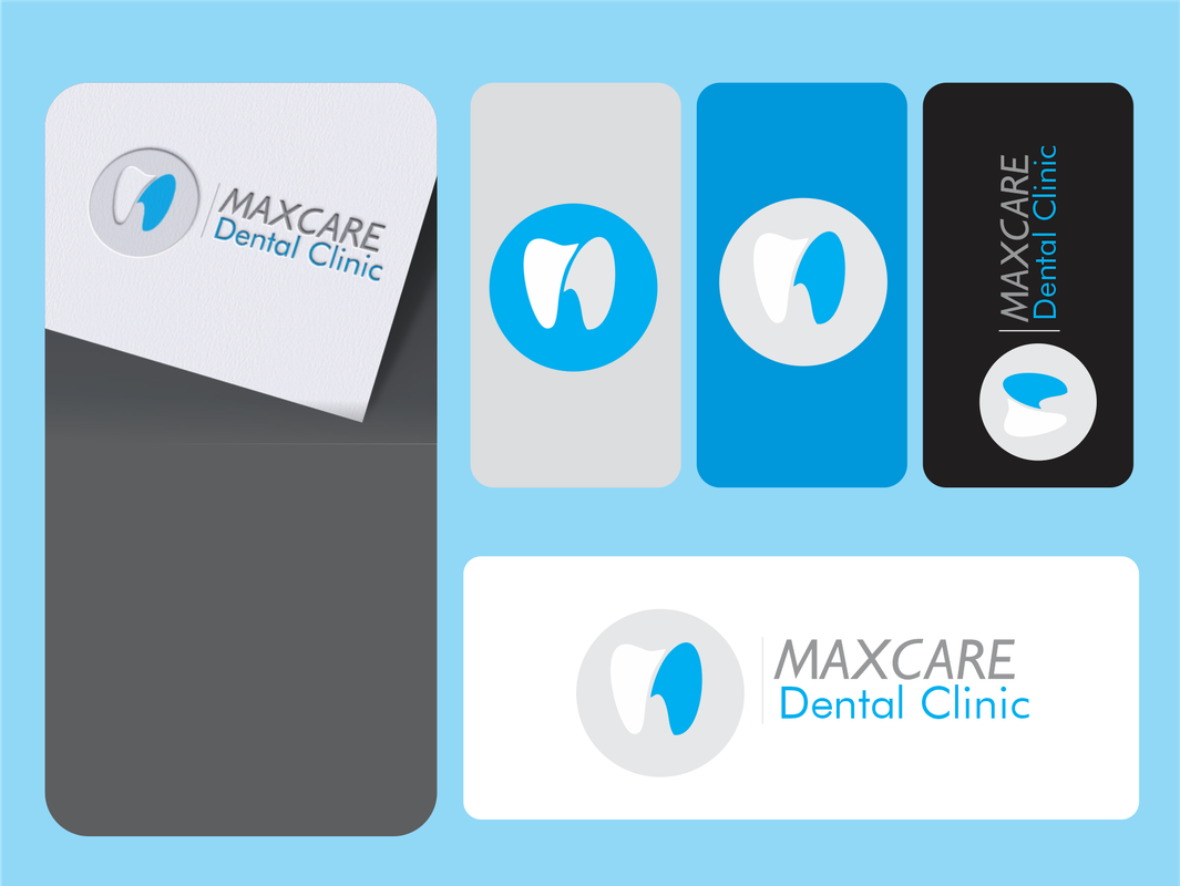
MaxCare
The Vision: A Smile Reimagined
Upstreet Studio Team embarked on a mission: to create a visual identity that speaks of trust, innovation, and compassionate care for MaxCare Dental Clinic. The aim was not just a logo, but a complete brand experience centered around the idea of “caring for your smile.”
The Concept: A Clean and Modern Aesthetic
We selected a palette of sky blue, white, and grey to evoke a sense of cleanliness, tranquility, and approachability. Sky blue symbolizes trust and health, white represents purity and professionalism, while grey adds a touch of sophistication.
The logo design centered around a stylized tooth with a vibrant blue accent. This icon visually represents the core of MaxCare’s mission: providing quality dental care. The curved shape mimics a friendly, inviting smile, creating a welcoming message.
The variations in the logo application are designed for adaptability across all materials:
- Business Cards: The sleek, white cards with embossed logos immediately communicate professionalism.
- Social Media Icons: simplified round images ensures instant recognition and brand consistency.
- Website and Signage: The logo on a white rectangle, supported by the clinic’s name in elegant typography.
The Result: A Brand That Radiates Confidence
The final design embodies a brand that’s modern, trustworthy, and committed to exceptional patient care. It’s a cohesive visual language that establishes MaxCare Dental Clinic as a leader in the industry.
Slogan: “MaxCare: Your Smile, Our Priority.”
Love this? Request a quote.
TechNova Zen
Upstreet Studio crafted a brand identity for TechNova Zen, a software development firm, with the objective of reflecting their forward-thinking approach, emphasizing innovation and exceeding expectations.
The core concept behind the design revolves around the intersection of technology and tranquility. The name “Zen” subtly hints at focus and clarity, while “TechNova” points to their innovative capabilities, resulting in a brand that is both modern and calming.
Visually, the color palette features a sleek, black background, chosen to create a sense of depth and sophistication and allow other design elements to stand out. The central icon is an abstract floral design, rendered in a warm, muted orange. Its petals symbolize growth, innovation, and the multifaceted nature of software solutions, while the circular arrangement evokes harmony and balance, reflecting the “Zen” aspect. For typography, the company name uses a clean, modern sans-serif font, providing a crisp contrast against the darker background. The slogan, “Beyond the idea…”, reinforces the company’s commitment to surpassing expectations and delivering unique results.
The overall aesthetic is minimalistic yet memorable, with a strong visual hierarchy. The orange floral icon immediately draws attention against the black backdrop. The typography is legible and clean, conveying professionalism, and the slogan elegantly captures the essence of TechNova Zen: a company that goes beyond initial concepts to deliver exceptional software solutions.
Ultimately, this design story produced a brand identity that is simple yet powerful. The logo and tagline work in tandem to evoke a sense of trust, innovation, and a promise of unparalleled results, successfully positioning TechNova Zen as a leader in the software development industry.
Love this? Request a quote.